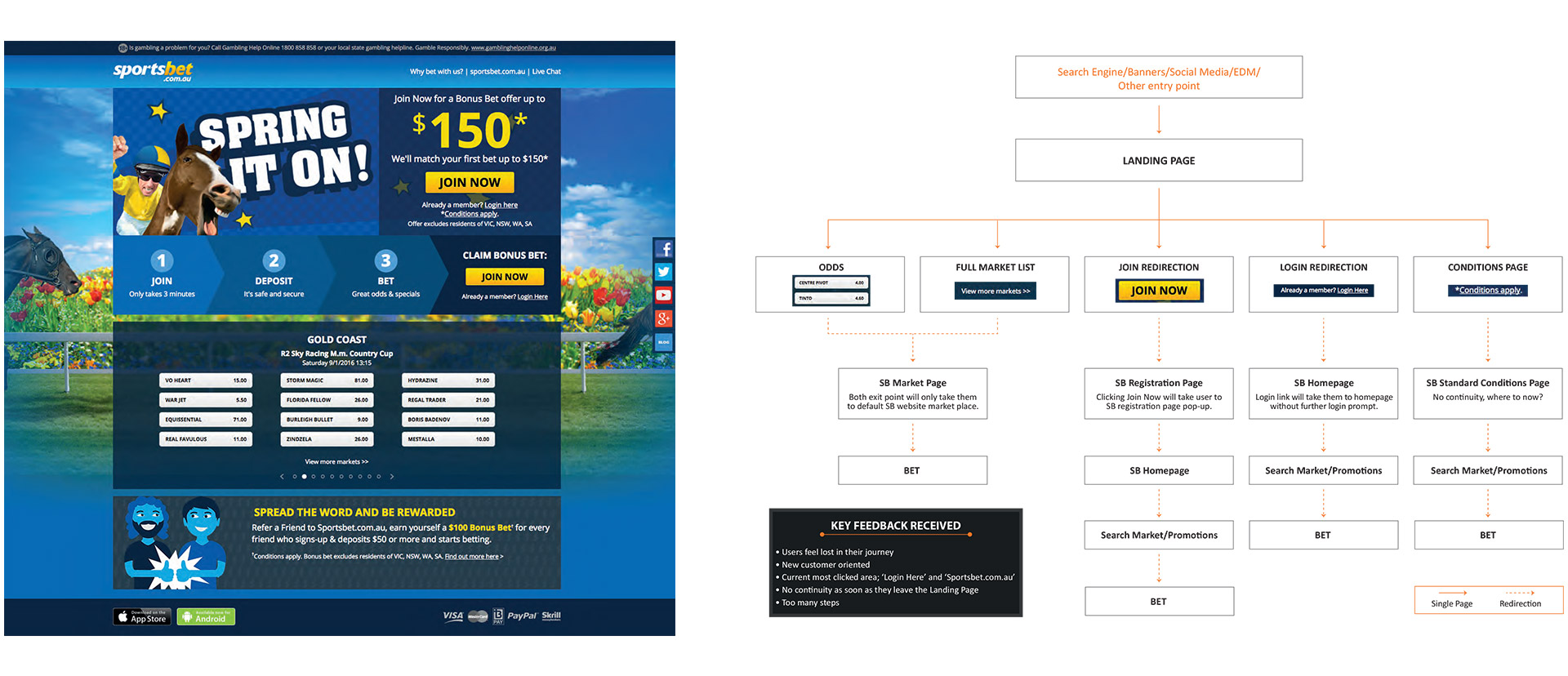
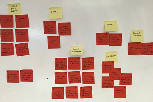
In collaboration with a dedicated researcher, I helped in conducting initial surveys and subsequent face to face interviews. Our initial assumption that users were feeling lost in their journey were indeed validated, making a compelling case for a complete review. We also discovered some other pain points that we didn’t think of, the main one being that the pages were very ‘new customer oriented’. Existing users were feeling alienated as a result.
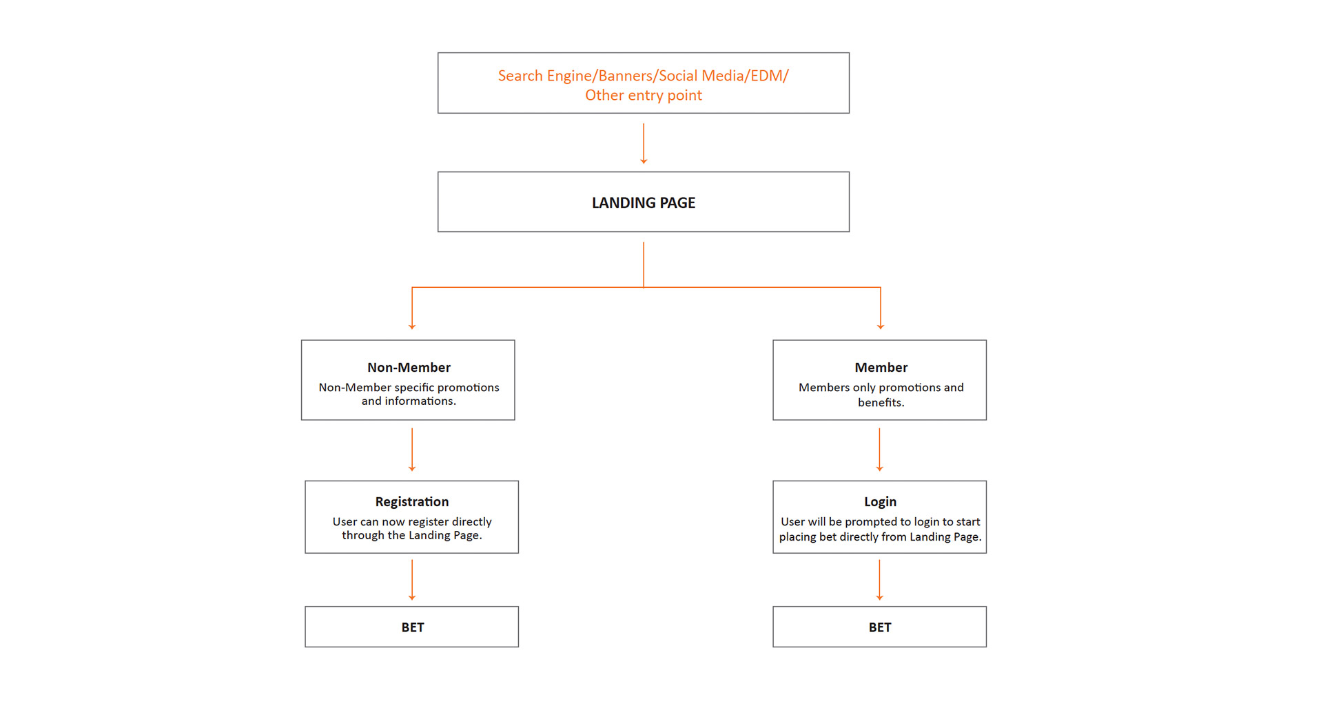
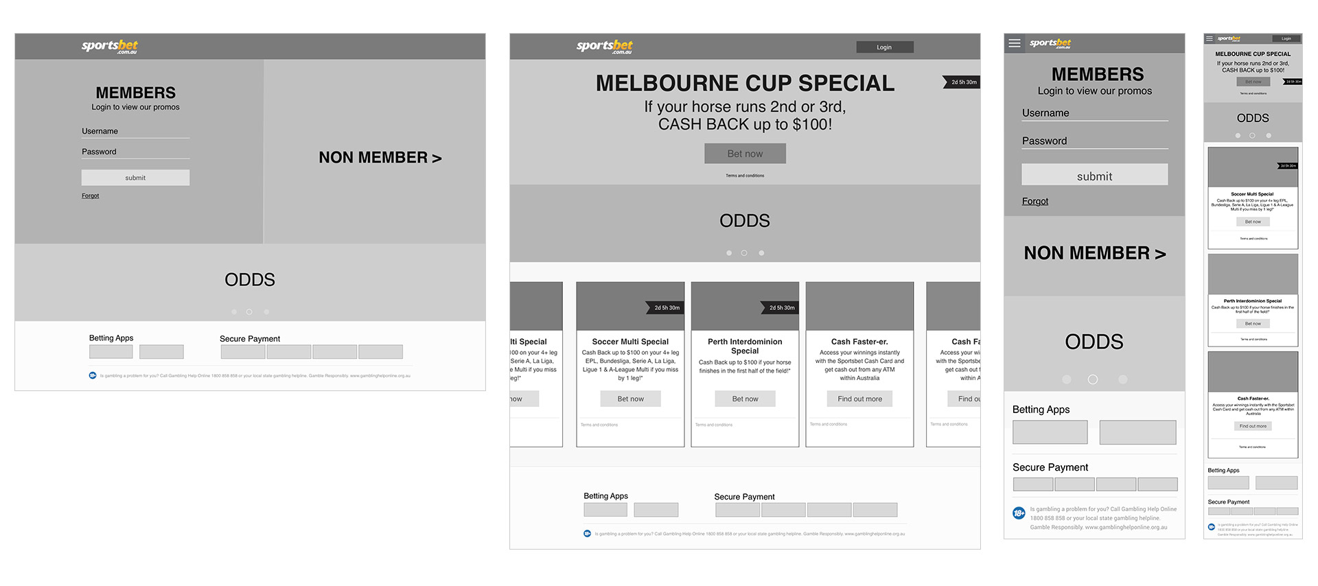
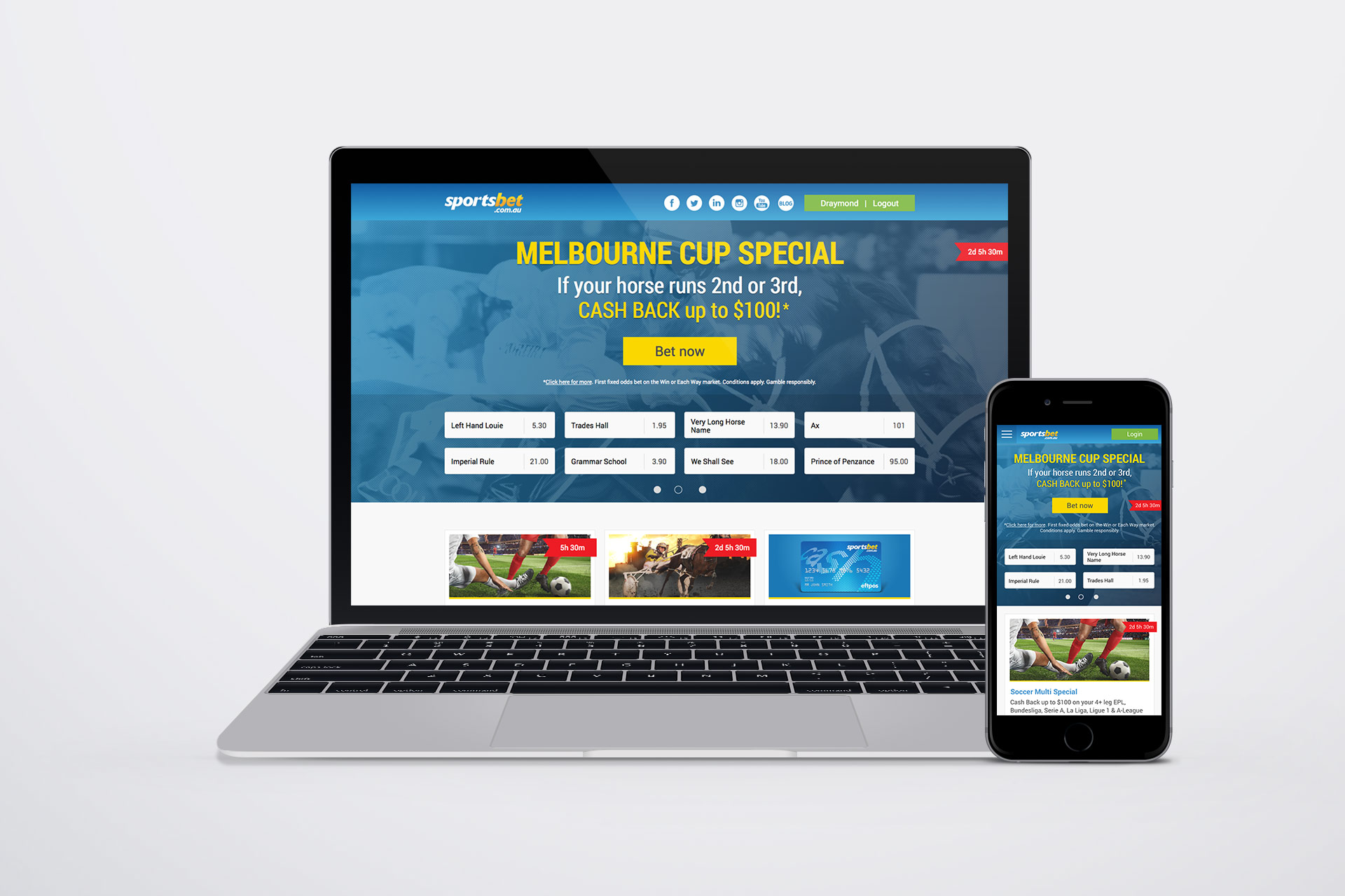
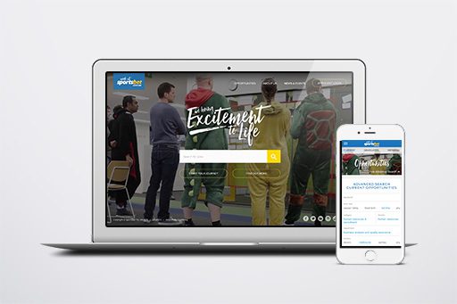
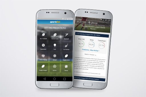
Making use of these insights, I set out to find solutions that could resolve the pain points that we have prioritised. The main hurdle was to strike a balance between technical, legal and solving customer problems. I redesigned the user journey and devised the responsive wireframes. After some iterations from feedback, I designed the UI with the purpose of removing superfluous visual noise.