Design lead, UX/UI, Prototyping, User research and testing, Interaction design, A/B testing
Easy Move is a dedicated experience aimed at getting people connected at their new home in a simple, painless, and effortless way.
The challenge
I was tasked with redesigning the Easy Move experience to address the concerning high fallout rate on the first screen. Conversion overall was lower than the sales funnel, where customers can also complete a move process but which was a longer experience. Another challenge was how to simplify an already simple design.
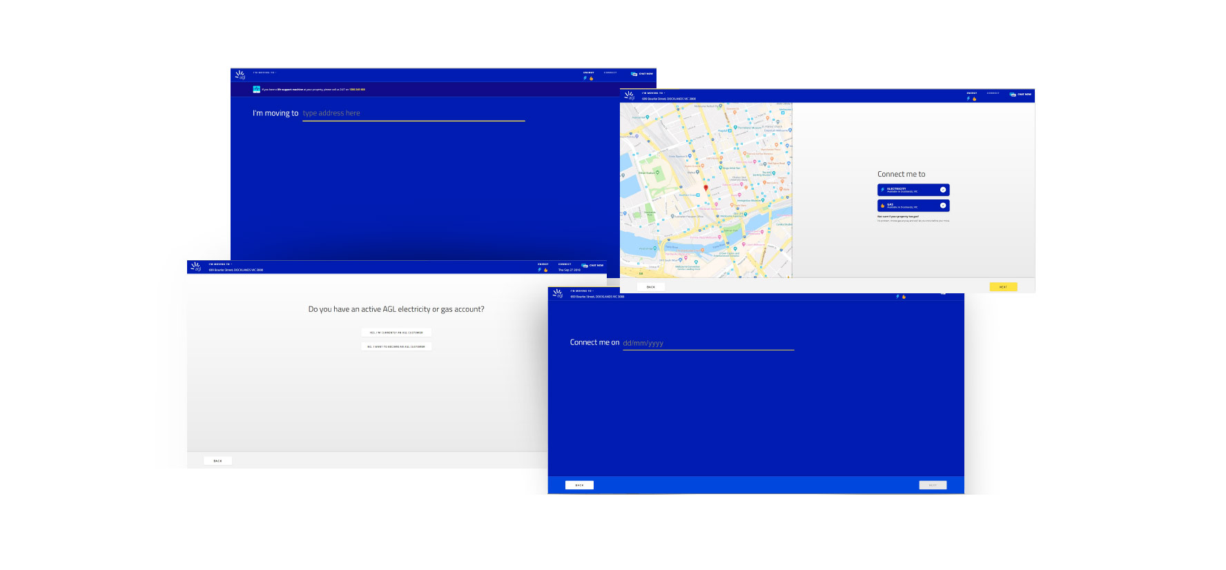
Old Easy Move experience
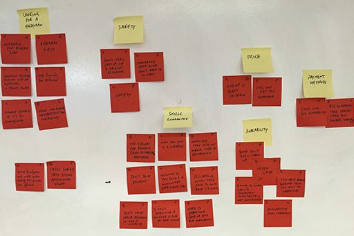
Review and Findings
Current experience starts with a screen with just one question. Because of various entry points, some people were landing on it without context.
As we progress through the flow, it still follows the wizard-like style of just one question per page.
While it seems relatively easy, it gives the users no indication of what’s happening, what has happened, what will happen next and how much is left to do.
The progress indicator at the top is almost unnoticeable and doesn’t really fulfil its purpose.
If we were to have a proper progress bar it would show around 10 steps, which seems like a lot.
I also found from users that not only there wasn't enough explanation of what's happening on the page, but there was also confusion around some of terms used.
REVIEW AND FINDINGS
Current experience starts with a screen with just one question. Because of various entry points, some people were landing on it without context.
As we progress through the flow, it still follows the wizard-like style of just one question per page. While it seems relatively easy, it gives the users no indication of what’s happening, what has happened, what will happen next and how much is left to do.
The progress indicator at the top is almost unnoticeable and doesn’t really fulfil its purpose.
If we were to have a proper progress bar it would show around 10 steps, which seems like a lot.
I also found from users that not only there wasn't enough explanation of what's happening on the page, but there was also confusion around some of terms used.
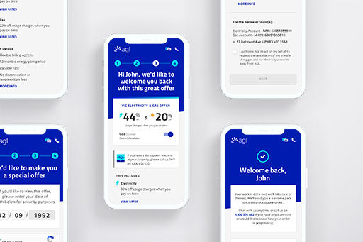
EXECUTION
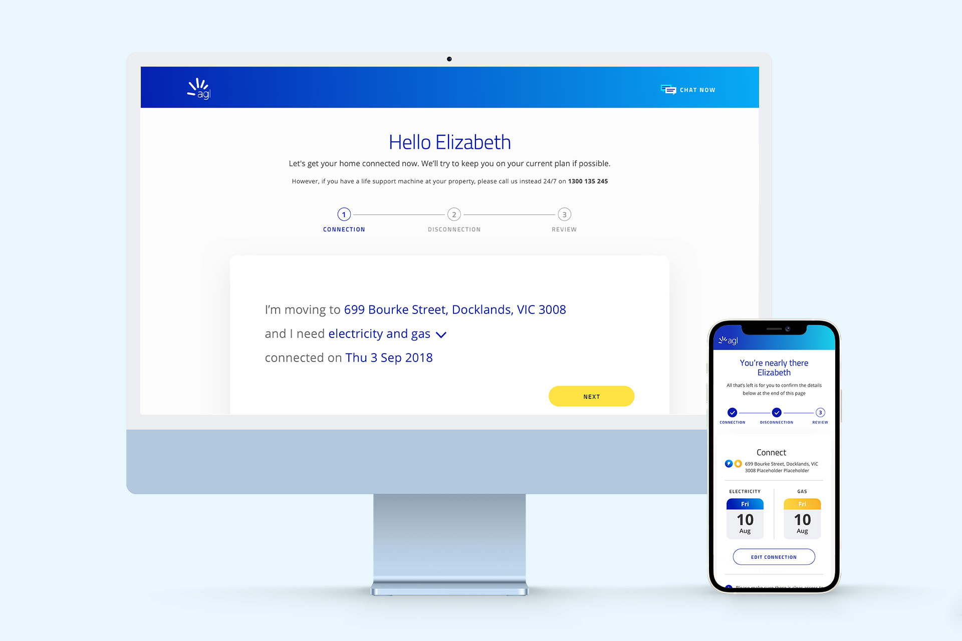
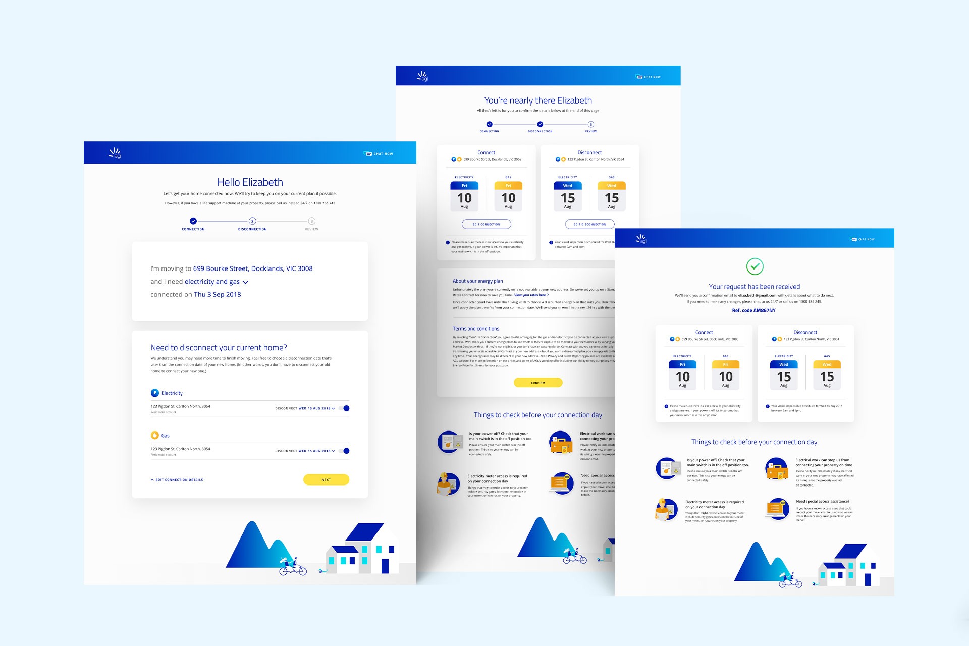
So how do we make it easier than just asking a single question on a page? By counterintuitively adding more questions to the first page!
We grouped the questions into chunks that make sense to help users process and understand.
So we have 3 simple steps: Connection, Disconnection and Review
Although we’re essentially asking the same questions, grouping them gives the illusion or perception that it’s faster and less to complete – it’s just 3 steps. It also reduces the number of clicks needed overall.
We can now also introduce the progress bar that does the job of telling users what’s happening, what has happened, and what will happen next and how much is left to do.
In the case of an unauthenticated flow, the second step becomes contextual depending if you’re an existing or new customer.
EXECUTION
So how do we make it easier than just asking a single question on a page? By counterintuitively adding more questions to the first page!
We grouped the questions into chunks that make sense to help users process and understand. So we have 3 simple steps: Connection, Disconnection and Review
Although we’re essentially asking the same questions, grouping them gives the illusion or perception that it’s faster and less to complete – it’s just 3 steps. It also reduces the number of clicks needed overall.
We can now also introduce the progress bar that does the job of telling users what’s happening, what has happened, and what will happen next and how much is left to do.
In the case of an unauthenticated flow, the second step becomes contextual depending if you’re an existing or new customer.
A cleaner and more aligned design, utilising and building off the current website experience.
Giving clearer context and expectation setting to users entering the flow via a redesigned landing page.
Outcome
Uplift in sales from users moving home
Increase in the number of users starting the move process
Better comprehension of the move process
Increase in the experience NPS
Completion rate drastically improved
OUTCOME
Uplift in sales from users moving home
Increase in the number of users starting the move process